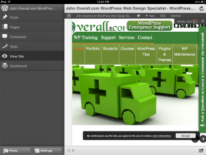
I saw the new WordPress iOS app announced as coming when I watched the State of the Word address by Matt Mulenweg. It sounded very exciting and had lots of promise. This post was created using the WordPress iOS app to see what kind of functionality was being offered as improvements over the old one which was never of any use to me.
So how did I find this new app to be? Well it is pretty nice in many ways but still lacks in a couple of others hopefully in the future these will be addressed as well. Now for the review.
Pros
The interface is cleaner and easier to understand the navigation is pretty smooth and takes very nice advantage of the touch screen.
Dealing with comments is a very easy task.
Creating posts and pages is also very easy but see cons as to issues I ran into.
It is very pretty and has a nice review window so you can look at your site without leaving the app. You can also switch to dashboard view without leaving the app and continue this post as I did in the hopes I could use the view box instead of code only.
When in dashboard edit you can access your other tools you have added.
It is very pretty
It is easier to add pictures from your iPad than it was before
Cons
I miss the view edit since I prefer to use the wysiwyg editor.
No easy way to look up a link from the app edit window but if I have something like insights installed you can still check it out.
I ended up finishing this though my computer since I did not like not being able to use the wysiwyg editor. Plus I wanted to fine tune and tweak my content.
To use additional tools like WordPress SEO was a bit difficult and was made easier by coming back to the computer.
Conclusion:
I can highly recommend the new WordPress iOS app and can recommend it to create drafts of your work on the go and finish them up later when your back in front of your machine. I do like the improved functionality of the app and the appearance if it. This app is a great improvement overall from previous attempts.


