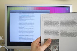
Optimal characters per line
Optimal characters per line
I’m sick and tired of cramped websites that have tiny type and don’t use the whole screen well. I’ve come to believe that the problem with reading on a screen isn’t the backlight—it’s that the type is too freaking small. Most designers don’t even know that there is an optimal number of characters per line. Let me take you through some of my thinking so that you can consider if you can take away any ideas to use on a project of your own. The fact you’ve read to this paragraph is proof that there is something to my argument.
I often hear people complain that they don’t like reading on a screen because of the backlight—I believe the real reason is tiny type. Reading online is more analogous to reading a dictionary than reading a book. The text is small and thin columned, it’s obvious that the designers goal was to fit a lot of information into a small amount of space. This may work for some applications, but lengthy reading is definitely not one of them.
On each full paragraph line of text on this blog there are about 75 characters—which is widely regarded as the most characters that you can put on a line and still have it optimal for readers. Read the Rest of the Article Here….


Comments are closed.